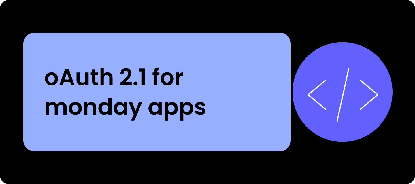
OAuth 2.1 is now open for all monday developers
Starting today, OAuth 2.1 is open to all monday app developers. After a successful beta with early partners, we're rolling the new flow out platform-wide.Why OAuth 2.1The new flow brings short-lived access tokens, refresh tokens, and token revocation to monday apps - core OAuth 2.1 concepts that match how modern OAuth works across the web.What does this change for your appStandard OAuth library support. The flow exposes its configuration at a single discovery URL. Modern OAuth libraries fetch this URL and auto-configure, so you don't need to set each value manually. PKCE is required. The new flow requires Proof Key for Code Exchange (PKCE), which prevents authorization code interception attacks. Most modern OAuth libraries handle this automatically. Background token refresh. Refresh tokens renew access tokens in the background, so users don't need to reauthorize each time an access token expires - you'll need to handle it on your backend. Token revocation. A new API lets you revoke access and refresh tokens at any time. Aligned with industry security standards. The flow follows OAuth 2.1 and the current OAuth security best practices.Migration timelineOctober 1st, 2026 - old tokens stop working. After this date, legacy OAuth tokens will no longer be valid. All apps must be migrated to the new flow before then.During the beta, some partners requested a token migration endpoint - a way to convert your existing tokens into the new format in bulk, rather than waiting for users to re-authenticate. If you have a large existing token database, and this would be important for your migration, let us know in the comments. Your feedback will help us decide whether to enable it during the migration phase.We recommend migrating as early as possible and testing against a draft version of your app before promoting to live. When you promote, the new flow applies to all users across every installed account.See the migration guide for the full technical details, and the OAuth migration skill for Claude Code.